Styling architecture
In a Design System project, styling in WaveMaker follows a structured, token-driven architecture. The same ideas apply to mobile: consistency, controlled customization, and safe extensibility when you export a React Native (Expo) app.
Styling flow overview
Styling is organized in layers that build on each other. Each layer has a clear role so tokens, defaults, and your changes stay separated.
Below are the same conceptual layers used across WaveMaker (your exported mobile app follows this flow end to end):
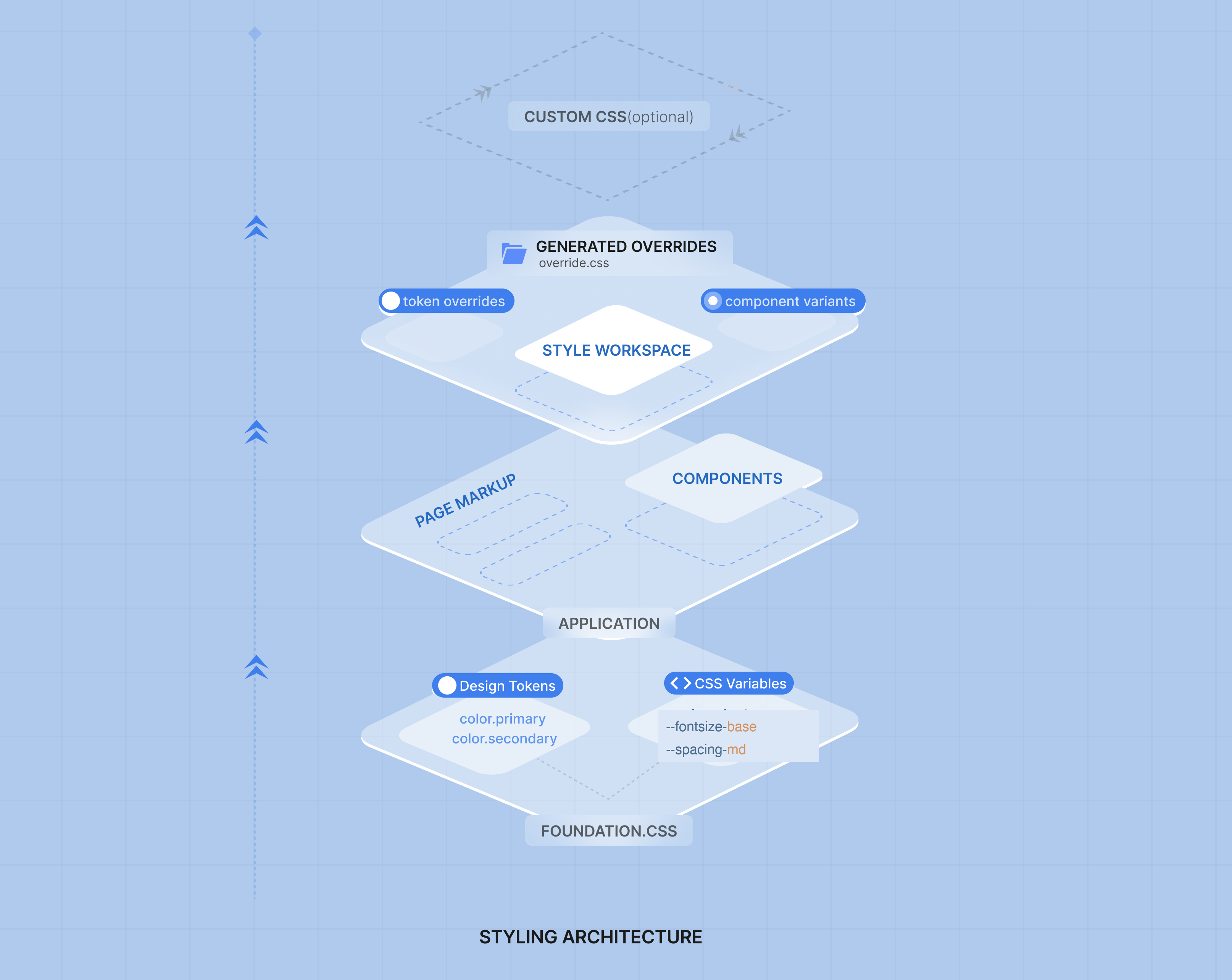
Layer 1 — Foundation and design tokens
Foundation CSS is the default theme for mobile. It is produced from mobile design tokens and is the visual source of truth for the product: it is not edited directly when you customize a project. Token types, folders, and how overrides layer on top are described in Design token architecture and Introduction to Foundation CSS.
Tokens are mapped into the theme the mobile runtime uses. Values stay centralized so global updates (for example a new primary color) propagate instead of being copied onto each widget.
Typography on mobile
In Style Workspace, brand and plain font settings use one font family name at a time (for example Roboto). Pick a family that is bundled or available on the devices you support.
A backup font may appear in token lists for reference, but mobile does not rely on a long “primary, then fallback, then system” font list the way a browser page often does.
Layer 2 — Components
The components layer consumes the Foundation theme.
WaveMaker mobile widgets use Foundation CSS and tokens for their default look, support variants where the design system defines them, and avoid one-off styling that drifts from the theme. When you change a token or variant, dependent widgets update together so screens stay aligned after export. See Introduction to Foundation CSS — Variants.
Layer 3 — Style Workspace and overrides
Style Workspace is where you customize and extend the theme.
You can:
- Override token values (colors, fonts, spacing, and more)
- Create or adjust component variants
- Preview changes before you export or run the app
When you save changes:
- Overrides are tracked separately from the base Foundation package
- Your project keeps a clear split between system defaults and project-specific styling
In the running app
The built Expo app includes theme data from tokens plus your overrides. Widgets apply styles through the mobile runtime theme. Only what you changed differs from the default; the rest follows Foundation.
Optional last mile
Prefer tokens and variants first. If something still cannot be expressed there, use widget properties in Studio (layout, captions, show rules, and similar) before introducing unrelated styling patterns.
Summary
The styling architecture stacks like this:
- Foundation and design tokens — default theme and global values for mobile (source of truth)
- Components — use Foundation and variants for a consistent UI
- Style Workspace — overrides and variants, tracked apart from the base theme
- Widget properties — optional fine-tuning in Studio when tokens and variants are not enough
- Application and page styles —
app.cssand page CSS for exceptions; see Customising your application
Together, this keeps mobile apps maintainable, consistent, and easier to update when the design system evolves.