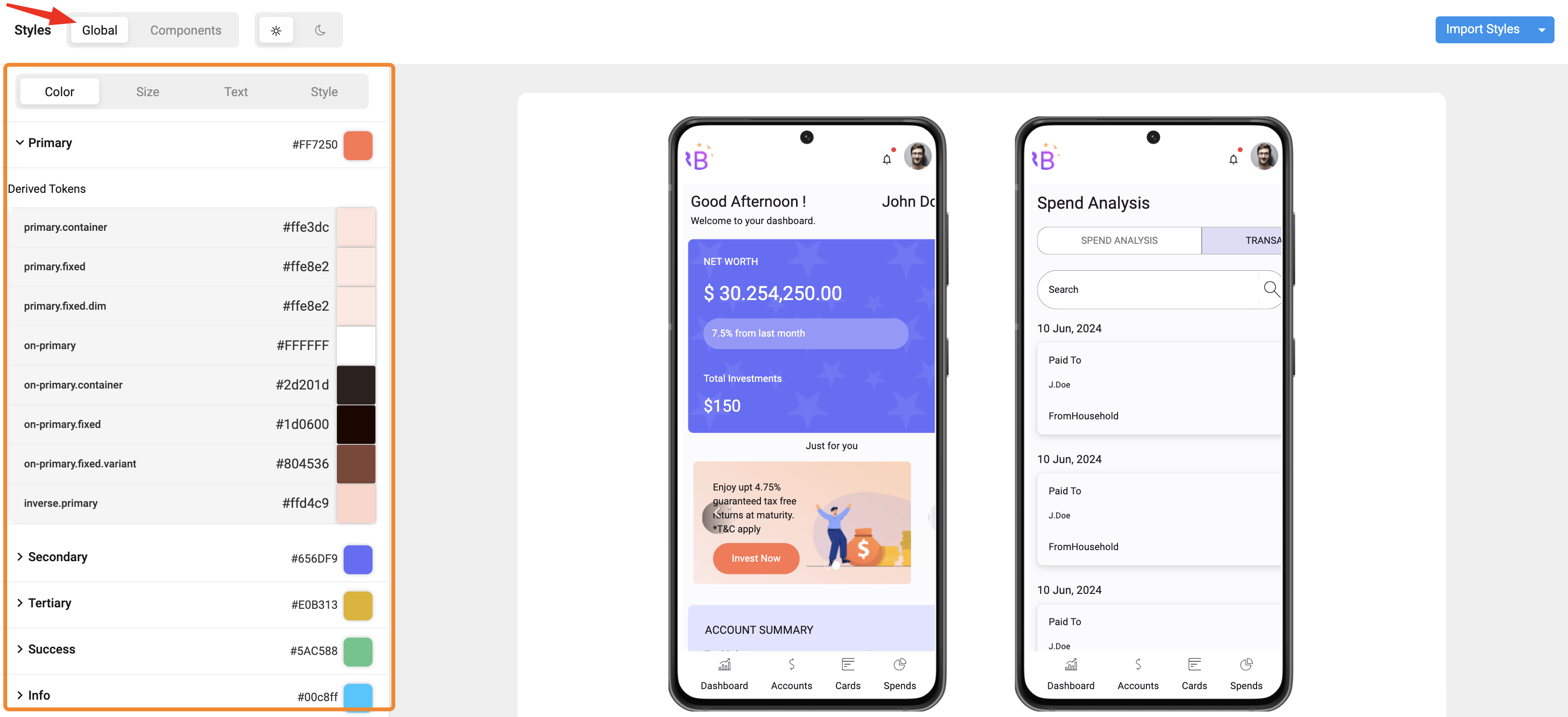
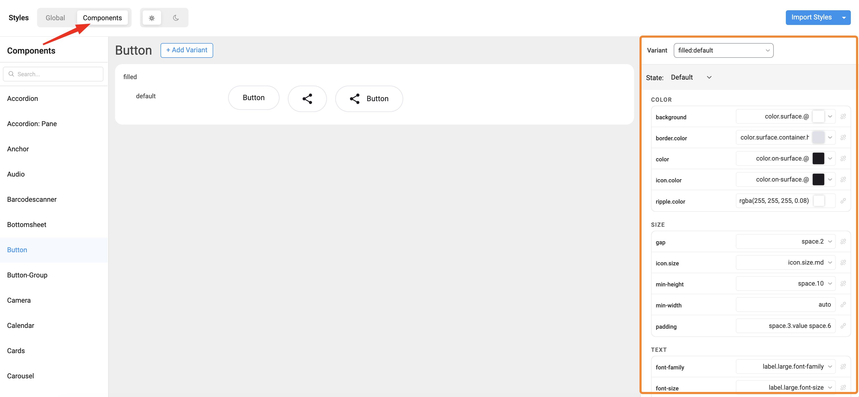
Working with Style Workspace
The Style Workspace in WaveMaker Studio is the visual editor for design tokens, variants, and component styles. For what each token layer means, see Design token architecture. For compiled output and export paths, see Customising your application.
You can:
- Browse and edit Global Tokens (colors, typography, spacing, radius, shadow).
- Expand Components (Button, Input, Card, etc.) to update their specific tokens.
- Switch between Appearances, Variants, and States to fine-tune the visual style.
Navigating the Style Workspace
To open the Style Workspace:
- Open your app in WaveMaker Studio.
- Select Style Workspace from the left sidebar.
- The workspace loads Global Tokens by default.
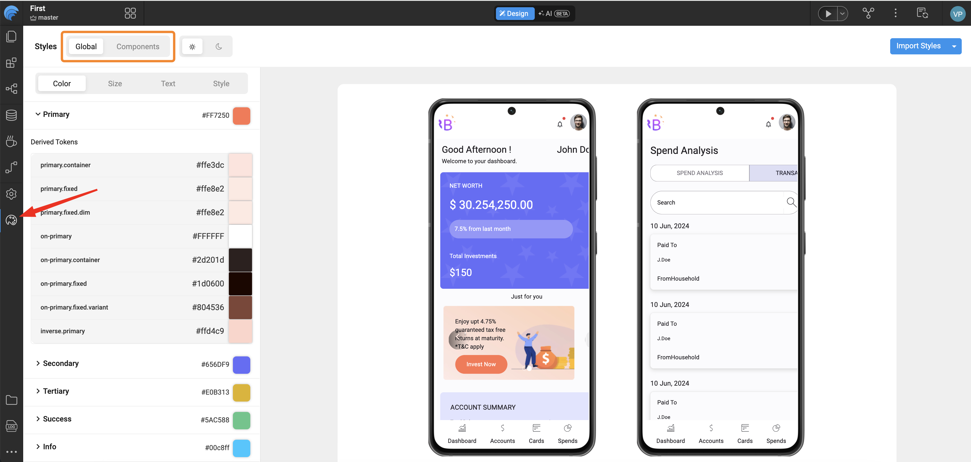
Key Navigation Areas
| Area | Description |
|---|---|
| Global Tokens Panel | Displays foundational design properties like color, font, spacing, radius, and shadows. |
| Components Panel | Lists all UI components (Button, Input, Card, etc.) that use tokens from the design system. |
| Preview Area | Shows real-time changes as you edit tokens. |
| Appearance / Variant / State Tabs | Allow you to define how a component looks, behaves, and adapts in different contexts. |
Appearances, Variants, and States
| Category | Description | Example |
|---|---|---|
| Appearance | Defines the overall component style. | Filled, Outlined, Text |
| Variant | Represents the purpose or hierarchy of a component. | Primary, Secondary |
| State | Shows how a component responds to interaction. | Active, Disabled |
Editing Tokens (Color, Size, Typography)
You can edit both Global Tokens and Component Tokens directly within the Style Workspace.
All edits are instantly reflected in the live preview. When you change colors, compare light and dark appearances in the preview so contrast stays balanced.
1. Global Tokens
Examples:
color.primaryfont.family.brandspace.2,space.4radius.sm
When you update a global token, every component that references it updates automatically in the preview.
How to Edit
- Expand a token group (e.g., Colors, Typography).
- Click on a token value (e.g.,
color.primary). - Adjust it using the color picker, dropdown, or numeric input.
- The preview area instantly updates to reflect your changes.
2. Component Tokens
Edit tokens for a specific widget family (for example Button). Component tokens inherit from global tokens for consistency or override them locally when you need a widget-specific look. See Design token architecture.
How to Edit
- Expand a component accordion (e.g., Button).
- Navigate to token groups such as Color, Size, and Text.
- Modify a token value.
- Observe real-time updates in the preview panel.
Saving and Viewing Generated JSON
Every change made in the Style Workspace is automatically saved as a JSON entry in your project’s overrides folder.
These JSON files form the single source of truth for all your design decisions.
Folder Structure:
src/main/webapp/design-tokens/overrides/
├── global/ → Global token definitions (colors, typography, spacing)
├── components/ → Component-specific overrides (button, card, input)
Examples:
- Editing
color.primaryupdates:
overrides/global/colors/color.light.json - Changing a Button background updates:
overrides/components/button/button.json
For how overrides are compiled and applied in Studio preview and your exported mobile app, see Customising your application.